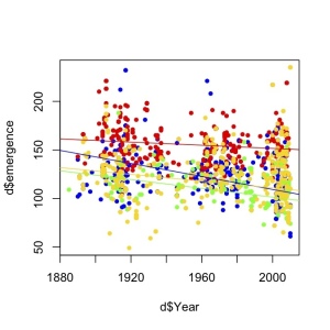
Last year I was working on a big dataset to assess how bee phenology has changed over time. Here it is the first cool figure I produced. I was quite excited so I didn’t even bother to make beautiful axes.
I am pretty sure the stats I finally used changed quite a lot, and I also added many more data points before publishing the results (it toke me a year to sort out all details), but the main result held. Bees are emerging earlier in recent time periods that they used to emerge. The final published figure looks like that:
While cleaning my computer today, I realised that my first plot looks way more colourful and exciting than the final figure I ended up publishing. Then, I remembered a text I wrote about analyzing data…
“I almost forgot the fun of first analysis when everything is new and exciting, when you want to know everything about “data” and you learn from “her” everyday… it’s a shame that after that it becomes repetitive and monotonous. You’ve lost the magic, but on the other hand, it’s also nice to really get to know each other, you gain compromise and confident results.”
So maybe my own plots can prove I was right, and Data analysis is like a love story. Are your first drafts also more pasional than the final version?


I can still remember my very first cyclic voltammogram… ah the memories!
I think you should have a conversation with Karin about this – she is a relationship therapist after all! :-)
P.S. – great paper by the way! I hope to cite it once I’ve finally stopped collecting data on flowering time change in a couple of plants I’ve been surveying since 1996.