I want to show you a pollination landscape, but this is not a pollinator landscape with flowers and nesting sites, but a plot showing two components of pollination. Quantity and quality. A recent paper by Pedro Jordano (see here for other work on seed dispersal landscapes) inspired me to plot my data that way, which I think is just awesome. I am a little ashamed I can not fully follow the part of his code (but is great that people is sharing code!) dealing with plotting the z axis… but if you have a hammer, all your problems will look like nails. And I had used recently expand.grid( ) and loess( ), so I used those to do my z axis. I also think is nice that people has two options to plot the data. So here is the plot:
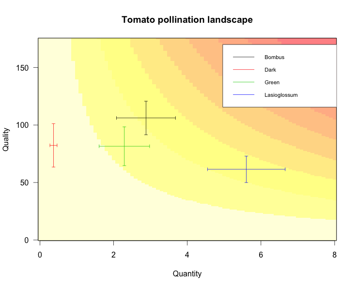
Here you just see that bumblebees and Lasioglossum provide similar total pollination levels (yellow), but through different mechanisms (quantity or quality).
Here you can find the code to reproduce the plot.
