SCAPE-2012 meeting highlights

Last weekend I attended the SCandinavian Association for Pollination Ecologists (SCAPE) meeting. I had a great time there, with many “big names” among the attendants (and very interesting “small names” too!). Compared to the last ESA meeting I attended in Portland this summer, with more than 4000 people and 13 parallel seasons running all day, having only 60 people in the same cozy room was a change. Both formats has its functions, but I think is usually more productive the small and informal gathering.

Before a brief summary of the best talks (according to my biased interests), I want to mention that I am surprised on the big gap between population ecologists (mainly plant ecologists) and community ecologists (networks and landscape stuff). I am clearly guilty of only thinking at the community (and ecosystem) levels, so it was nice to be reminded about genes and specific process occurring at lower levels.

Four talks I liked:

Amots Dafni gave a great talk dismounting and old and beautiful hypothesis suggesting that floral heat reward attracts males to overnight inside the flower, and hence pollinate the plant. Despite the idea is neat, and flowers are indeed around 2ºC warmer than the environment, warmer flowers (those facing east and getting the morning sunlight) did not host more bees. They also show that no other reward is offered, and that no bee-attractive volatile compound was produced as a deceptive attraction mechanism (like the one in some orchids). The icing of the cake was showing that the bees visually perceive the flower entrance as a hole or crevice (i.e. black), indicating that the most parsimonious explanation is that flowers use shelter mimicry to attract the males. For me the most important point was to don’t get too attached to beautiful hypothesis, as often they are not supported when tested rigorously.

Erin Jo Tiedeken (in Jane Stout lab) showed that bumblebees (B. terrestris) can not detect natural levels of toxics (both natural plant toxics and insecticides) in the nectar (lab conditions). Most toxic compounds have low volatility, so that’s bad news for bees exposed to Neonicotinoids.

Robert Junker showed that floral bacterial community is more similar among flowers of different plants, than among different organs (e.g. leafs) of the same plant. Not sure what to do with that, but it’s intriguing!

Jan Goldstein did an experiment (unfortunately un-replicated) removing a network hub from a plant-pollinator network. This is a common practice on simulations to assess robustness of the networks. In those simulations when a species loses all their links is assumed to disappear from the network, however, Jan showed that most species visiting the hub, just change its visitation pattern to another plant when this hub is removed experimentally (i.e. re-wiring). Tarrant and Ollerton have a similar experiment with consistent results and I hope its published soon.

My slides here.

Why analysing your data is like being in a romantic relationship

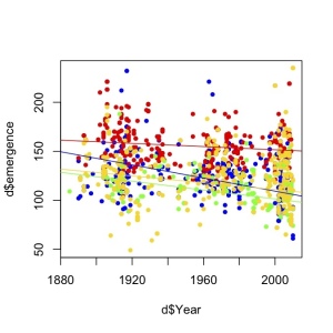
Last year I was working on a big dataset to assess how bee phenology has changed over time. Here it is the first cool figure I produced. I was quite excited so I didn’t even bother to make beautiful axes.

I am pretty sure the stats I finally used changed quite a lot, and I also added many more data points before publishing the results (it toke me a year to sort out all details), but the main result held. Bees are emerging earlier in recent time periods that they used to emerge. The final published figure looks like that:

While cleaning my computer today, I realised that my first plot looks way more colourful and exciting than the final figure I ended up publishing. Then, I remembered a text I wrote about analyzing data…

“I almost forgot the fun of first analysis when everything is new and exciting, when you want to know everything about “data” and you learn from “her” everyday… it’s a shame that after that it becomes repetitive and monotonous. You’ve lost the magic, but on the other hand, it’s also nice to really get to know each other, you gain compromise and confident results.”

So maybe my own plots can prove I was right, and Data analysis is like a love story. Are your first drafts also more pasional than the final version?


Long-term goals

I was skimming trough “How to Do Ecology” book from Karban and Huntzinger*, when I read that is important to have a long-term goal in your career. Something to use as a reference tool to see how your articles contribute to that goal and help you focus your career. I just panic for a second, not sure of having one. What if I am constructing my research program in an opportunistic way? Given I published on organisms as diverse as plants, birds or bees, or topics like biological invasions, pollination, or climate change, I was not sure that all this articles contribute to a long-term goal. The panic only lasted for a few minutes, as I realised that my main interest (and now my goal) is to understand human modified ecosystems. Indeed, I was quite happy to see that most of my research can help understand how this human dominated ecosystems work, or which species can survive in human modified ecosystems and which not, or how species adapt to live in human modified ecosystems. By that time I started thinking that Human Modified Ecology needs a good acronym, so I spent the next ten minutes trying to find a funny one… but that is less interesting (and I didn’t succeed). So the take home message is that I am glad to have verbalized my long-term goal, and be conscious of having one. I’ll take Karban’s advice and try to be more conscious of what I do and why I do it.

*I recommend that book to any grad student starting the PhD. Also good advice for everyone from Alon here and here.

Running motivation #An R amusement

Henry John-Alder told me once that in a marathon, twice as runners cross the line at 2h 59m than at 3h 00m. He pointed out that this anomaly in the distribution of finishers per minute (roughly normal shaped) is due to motivation. I believe that. I am not physically stronger than my friend Lluismo, in fact we are pretty even, but some times one of us beat the other just because he has the right motivation…

But where is the data? Can we test for that? Can we get a measure of how motivated are runners by looking at the race times distribution? The hypothesis is that runner groups that deviates from the expected finishing time distributions are more likely to contain motivated runners. It happens I did a race a couple of weeks ago, so I can fetch the results, create an expected distribution and compare that to the observed values.

I am interested in separating motivation from physical condition because is a real problem in behavioural ecology (See Sol et al. 2011). And because working with my race data is a lot of fun.

First we need to read the results from the webpage and extract a nice table:

# load url and packages
url <- "http://www2.idrottonline.se/UppsalaLK/KungBjorn-loppet/KungBjorn-loppet2012/Resultat2012/"

require(plyr)
require(XML)
require(RCurl)

# get & format the data
doc <- getURL(url)
doc2 <- htmlTreeParse(doc, asText = TRUE, useInternalNodes = TRUE)
tables <- getNodeSet(doc2, "//table")
t <- readHTMLTable(tables[[1]])
tt <- as.matrix(t)
tt <- as.data.frame(tt)
# Select only the 10K men class and make variable names
data <- tt[c(150:391), c(2, 3, 4, 6)]
colnames(data) <- c("place", "number", "name", "time")
head(data)

##     place number             name  time
## 150     1    624    Hedlöf Viktor 32:52
## 151     2    631      Vikner Joel 33:18
## 152     3    414   Sjögren Niclas 33:47
## 153     4    329    Swahn Fredrik 33:48
## 154     5    278    Sjöblom Albin 34:04
## 155     6    311 Lindgren Fredrik 35:31

Cool, we need to get the number of finishers per minute, now.

# create an 'empty' minute column
min <- c(1:length(data$time))
# if time has hour digits, transform to minutes
for (i in 1:length(data$time)) {
    if (nchar(as.character(data$time[i])) > 5) {
        min[i] <- as.numeric(substr(data$time[i], 3, 4)) + 60
    }
}
# select just the minute value for the rest of the data
min[1:237] <- as.numeric(substr(data$time[1:237], 1, 2))

And plot the number of finishers per minute

plot(table(min), xlab = "minute", ylab = "finishers per minute", xlim = c(30, 
    63))

That is approximately a normal distribution! (way better than my usual ecological data). In that case, let’s create an expected perfect normal distribution with mean and sd based on this race. I will use that as the expected times in the absence of motivation. If each runner performs accordingly only to its physical conditions; given enough runners they will fall in a perfect normal distribution (that is a model assumption).

# create the density function
x <- seq(32, 63, length = length(data$time))
hx <- dnorm(x, mean(min), sd(min))
# transform densities to actual number of expected finishers per minute:
# create an expected (e) 'empty' vector and for each minute calculate the closest x value and its correspondence density (hx) multiplied by the number of runners.
e <- c(32, 63)
for (i in 1:length(c(32:63))) {
    e[i] <- hx[which.min(abs(x - c(32:63)[i]))] * length(data$time)
}
# Check the total number of runners predicted is close to the real one (242)
sum(e)  #close enough

## [1] 239.1

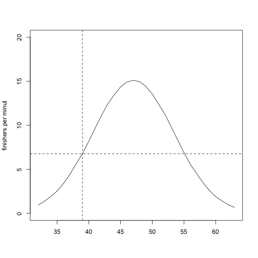
plot(c(32:63), e, ylim = c(0, 20), type = "l", ylab = "finishers per minute", xlab = "")
abline(v = 39, lty = 2)
abline(h = 6.77, lty = 2)

So, based on the plot, I predict 6.77 runners on 39 minutes (see dashed line), and 8.20 in 40. If being below 40 minutes is a goal, we expect motivation to show up there as a deviation from the expected values… Let’s plot both things together

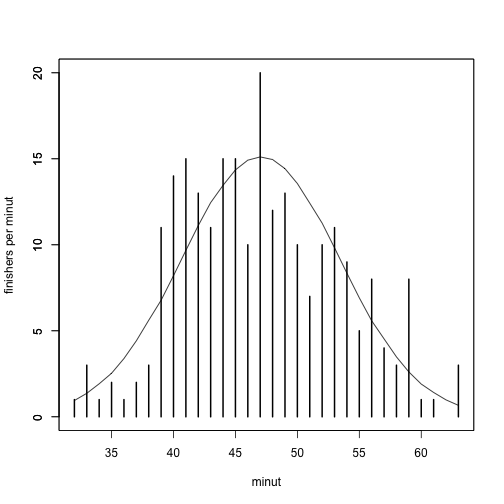
plot(c(32:63), e, ylim = c(0, 20), type = "l", ylab = "", xlab = "")
par(new = TRUE)
plot(table(min), xlab = "minut", ylab = "finishers per minut", ylim = c(0, 20), xaxt = "n")

Well, the observed value at 39 minutes is 11,  higher than the expected 6.77, but minute 40 and 41 are also higher than expected. Maybe being around 40 is the real motivation? We can visualize the observed minus expected values as follows:

o <- as.vector(table(min))
# add a 0 on minute 61, to make vectors of same length
o[31] <- 0
o[32] <- 3
# calculate difference
diff <- o - e
plot(c(32:63), diff, xlab = "minutes", ylab = "difference")
abline(h = 0, lty = 2)

Not a super clear pattern. But positive values for the first half of the finishers indicates motivation, however, take into account that positive values on the second part imply demotivation. Let’s do the sums:

sum(diff[1:16]) #1st half part

## [1] 10.75

sum(diff[17:32]) #second half

## [1] -7.892

The distribution is skewed to observe faster times than expected. I interpret this as an indication that most people was in fact motivated (half first part of the finishers deviations >> second half). We could have asked the people, but if you work with animals, they don’t communicate as clear (and humans can lie!). So, Is this approach useful? Maybe if instead of 242 runners and 10 k I use the NY marathon data, it will give us a clearer pattern? We will never know because is time to go back to work.