I have a new scarf depicting the temperatures of the last 100 years in Barcelona. The warmer the colors, the hotter the temperatures. This was a very cool project we did with my wife (she is the artist, I just crunched the numbers). It’s not only super pretty but a great conversation opener. Especially for young people, who suddenly realize all their life has been warmer than it used to be. I love it. But it’s ironic that winters are getting shorter and milder and I can’t use my scarf as much as I would like.
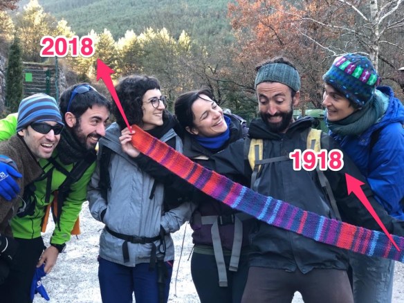
Showing off my new scarf to my beloved friends.
It has been inspired by the knit linen stitch version of the Tempestry Project. Every year is represented by four rows in linen stitch (right side, wrong side, rs, ws), in a color that represents the mean temperature of that year. Data comes from the Barcelona meteorological observatory ; (which has more than 200 years of monthly mean temperature data!)
We categorized the temperatures in 7 categories and selected 7 colors within a blue-red gradient. Here is the lines pattern we used starting on 1918 and ending in 2018. “1” represents the colder years, “7” the warmer years:
1 3 4 2 2 3 1 4 4 4 3 4 3 1 2 4 2 2 5 3 2 2 1 3 5 3 5 2 6 5 6 5 2 4 4 2 4 1 2 3 3 2 5 2 2 4 2 3 4 3 1 3 2 1 3 2 2 3 2 2 3 1 4 4 5 2 3 4 4 5 6 6 3 4 3 6 6 3 7 5 5 6 6 5 7 5 4 7 6 5 7 4 7 6 6 7 7 7 7 7
The code I used to convert temperature to colors is as follows:
#read the data:
bcn <- read.table(url("http://static-m.meteo.cat/wordpressweb/wp-content/uploads/2019/01/01160205/Barcelona_TM_m_1780_2018.txt"))
head(bcn)
#Create a dataframe with mean anual temperatures per year
d <- data.frame(year = bcn$V1, mean_t = rowMeans(bcn[,2:13]))
#select the last 100 years (use more if you want a longer scarf)
d <- tail(d,100)
#create a nice color gradient from blue to red (7 colors)
mypal <- colorRampPalette(c( "blue", "red" ))(7)
mypal
[1] “#0000FF” “#2A00D4” “#5500AA” “#7F007F” “#AA0055” “#D4002A” “#FF0000”
#Create a function to convert numbers to colors
map2color<-function(x,pal,limits=NULL){
if(is.null(limits)) limits=range(x)
pal[findInterval(x,seq(limits[1],limits[2],length.out=length(pal)+1), all.inside=TRUE)]
}
colors <- map2color(d$mean_t,mypal)
#visualize it
barplot(height = rep(1,length(d$mean_t)), col = colors)
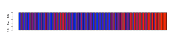
#and extract the row numbers,
#as.numeric(as.factor(colors))
1 3 4 2 2 3 1 4 4 4 3 4 3 1 2 4 2 2 5 3 2 2 1 3 5 3 5 2 6 5 6 5 2 4 4 2 4 1 2 3 3 2 5 2 2 4 2 3 4 3 1 3 2 1 3 2 2 3 2 2 3 1 4 4 5 2 3 4 4 5 6 6 3 4 3 6 6 3 7 5 5 6 6 5 7 5 4 7 6 5 7 4 7 6 6 7 7 7 7 7
Thise are all available years from 1780 to 2018, FYI:
3 4 2 4 2 3 3 3 4 3 4 4 4 4 4 3 3 3 5 4 3 3 3 3 4 2 3 3 2 2 2 4 2 1 1 2 1 2 3 4 2 4 5 3 3 3 3 2 4 2 3 5 3 3 4 2 2 2 3 3 3 3 3 2 3 3 6 5 3 5 3 2 4 2 2 3 3 3 4 4 3 4 4 4 4 5 5 4 4 4 4 3 4 4 4 4 4 4 3 2 3 3 5 2 5 4 2 1 2 4 3 3 3 4 4 5 4 6 4 5 5 3 3 3 4 3 4 3 3 2 3 5 4 3 3 3 4 2 3 3 5 5 4 4 4 3 5 5 5 4 5 4 3 4 5 4 4 6 5 4 4 3 4 6 4 6 4 6 6 6 6 4 5 5 4 5 3 4 5 5 4 6 4 3 5 4 5 5 5 3 5 4 3 4 4 4 4 4 4 5 3 5 5 6 4 5 5 5 6 7 6 5 5 5 7 6 5 7 6 6 6 7 6 7 6 5 7 6 6 7 5 7 7 6 7 7 7 7 7


 It was written in 1920’s and is surprisingly modern. He makes a strong argument to let the data talk for your science and he make some very relevant points against the inclusion of honorary authors. I also love his steps to write a paper: