is.invasive( )

Celebrating that I am contributing to the R-bloggers.com blog aggregator I am going to post a very simple function to check which species (both plants and animals) are considered “invaders” somewhere in the world. Basically the function asks that to the Global Invasive Species Database (GISD).

I coded this because a friend of mine aks me precisely that question [Yes, friends assumes you should know this kind of stuff (and also why the plants of their balcony are dying) off the top of your head just because you are a biologist]. However, I do not know much things and I am too lazy to check all 250 species one by one on the GISD webpage. Also is a good R practice, and I am ok investing some work time on personal projects. Google (and other big companies) encourage it’s employees to spend 20% of the time working on projects that aren’t necessarily in their job descriptions in order to bust its innovation power, so that should be even more important in science!

Hope it can be useful to more people, I uploaded the code as a Gist:

UPDATE: The function is now available on taxize R package developed by the rOpenScience people!


is.invasive()
##Description##
#This function check which species (both plants and animals) are considered "invaders" somewhere in the
# world. For that end, it checks GISD (http://www.issg.org/database/welcome/) and returns a value, either
#"Not invasive" or the brief description presented in GISD. Note that the webpage contains more
#information. Also note that the function won't tell you if it's exotic in your area, a lot of exotic
#species are not considered invaders (yet). As expected, the function is as good as the database is, which
#I find quite reliable and well maintained. The database is also able to recognize a lot (but not all) of
#the species synonyms. This function worked for me, but I didn't test it intensively, and any changes on
#the webpage html design will return wrong values. Apply the usual disclaimers when using it.
#The function is slow (not optimized at all), so be patient with long lists of species.
#Author Ignasi Bartomeus (nacho.bartomeus#gmail.com). Last updated 23 Nov 2012.
#Usage:
is.invasive(sp, simplified.df = FALSE)
#Arguments:
#sp: a vector of species names in latin (Genus species)
#simplified.df: Returns a data.frame with the species name and the values "Invasive", "Not Invasive". I
#recomend to check first the not simplified version (default), which contains raw information about the
#level of invasiveness.
#The function:
is.invasive <- function(sp, simplified.df = FALSE){
require(plyr)
require(XML)
require(RCurl)
#reformat sp list
species <- gsub(" ","+",sp)
#create urls to parse
urls <- paste("http://www.issg.org/database/species/search.asp?sts=sss&st=sss&fr=1&x=13&y=9&sn=&quot;,
species,"&rn=&hci=-1&ei=-1&lang=EN", sep = "")
#create a data.frame to store the Output
Out <- data.frame(species = sp, status = c(1:length(urls)))
#loop through all species
for(i in 1:length(urls)){
#Parse url and extract table
doc <- htmlTreeParse(urls[i], useInternalNodes = TRUE)
tables <- getNodeSet(doc, "//table")
t <- readHTMLTable(tables[[4]])
tt <- as.matrix(t)
if(length(grep("No invasive species currently recorded",tt, value = TRUE)) > 0){
Out[i,2] <- "Not invasive"
}
else{
if(simplified.df == FALSE){Out[i,2] <- tt[12,1]}
else{Out[i,2] <- "Invasive"}
}
print(paste("Checking species", i+1))
}
print("Done")
Out
}
#Example:
sp <- c("Carpobrotus edulis", "Rosmarinus officinalis")
## first species is invasive, second one is not.
d <- is.invasive(sp)
d
d <- is.invasive(sp, simplified.df = TRUE)
d

view raw

is.invasive.R

hosted with ❤ by GitHub

Spanish researchers are moving north (and it’s not climate change)

No real post today… Too busy with the Ramon y Cajal fellowships. A tenure track without granted tenure even if you excel along the track. As always, a chaotic application web and poor information is the first selection process for the brave Spaniards willing to get back home… Good luck to everyone trying to complete the migration cycle!

Can niche and fitness differences explain biological invasions

Following up with my “Theory vs Data” post, I want to share an example of a beautiful theoretical framework to understand the invasion processes and an idea on which can be the perfect study system to validate it.

Mc Dougall et al (2009) have one of the more compelling figures I saw summarising the hypothesis that niche and competitive differences between exotic and native species can explain the outcome of the invasion process. The figure speaks for itself:

While I was in the US I planned to use this framework to understand the effects of Osmia cornifrons (a mason bee) invasion on the native Osmia lignaria, but I had no time to follow-up on this. Anyway, for that end you would need to prove the following:

1) Are their niches overlapping? Both bees are on the same genus, have similar size, phenology, nesting habits, and probably visit similar flowers, you just need to put numbers on those things (e.g. which hole diameter they prefer to nest on). For example, this data is from a preliminary experiments I did on its phenology. Interestingly, the result suggest the invader emerge slightly (but significantly) earlier than the native. So, quantifying all this can be important.

2) Is their fitness different when raised alone? Buying this bees and monitoring its nests is easy. Moreover, measuring offspring (a fairly good proxy of fitness) is a piece of cake compared with other species. Well, at least in theory, because I tried it in 2011 and an April snowstorm killed 80% of both populations. Hence, I have no data here.

3) It’s the native fitness lowered when they are raised together? That’s an important part (especially the effect size), because they may coexists just fine (even if sharing niches).

I am not in the US anymore, so, is impossible for me to do the experiments. If anyone wants to explore this idea further (undergraduates seeking for a project, jump in!), the idea is here, and it’s for free!

———————————————————————————————-
MacDougall A.S., Gilbert B. & Levine J.M. (2009). Plant invasions and the niche, Journal of Ecology, 97 (4) 609-615. DOI: ———————————————————————————————-

And now, what can occur with this post? 

– Worst thing it can happen is that nothing happens.

– Will be pretty cool if someone does this or similar experiments, even if I never know of its existence (well, I hope at least not to miss the article when it gets published!). I would be happy with that because despite I did some thinking on this I assume this ideas are “on the air”, and that’s precisely why I post them here.

– Will be awesome if that someone also contact me and we end up collaborating. (incentive: I have also some ideas on how to analyse it)

– Will be terrific (I am running out of superlatives) if people start reporting they have data on niche and fitness differences for other systems and we end up with a meta-analysis proving (or disproving) that this theory can correctly predict invasion outcome with some generality. For example, where is propagule pressure fitting in this framework? Niche and population growth/species traits hypothesis clearly are captured here, you can even account for lowered native fitness due to disturbance (wow!), but the number of invaders arriving may be a missing piece. Also scaling up to the community level seems a daunting task.


Context dependent

In the last meetings I attended, I observed an interesting behaviour among ecologists (including myself), and is that despite sometimes they present contradictory results, they get along pretty well. I understand that this is not the case among taxonomists, or physicists, where there is a single right answer (comic is not based on a true story). Ecologists can discuss several options regarding why the results presented are not general, but at the end, nobody claims to have the truth. Is there a “right answer” when understanding ecological processes? Is just that is hard to measure all the relevant variables, or even in the case where we can measure everything accurately, the stochasticity is too high?

I like to think that ecological theory is not only intellectually exciting, but that it allows for a general understanding of ecosystems. However, I keep finding context specific ecological responses everywhere, and few theories in ecology has a good predictive power. Maybe ecosystems are too complex to be predictable at fine scales. Maybe, like climatic models, we can predict next year general functioning of an ecosystem, but we can’t tell if a species will interact with another one next week. But maybe we just need to bring together better theory and better data and see if we can make sense of it. I am trying to put together data that usually is analyzed independently, but that is potentially affecting the same process. I hope that the combination of datasets fits better the theory than it does when data is analyzed independently. Despite stochasticity is everywhere, I want to think there is still room to improve the mechanistic understanding of complex ecosystems.

SCAPE-2012 meeting highlights

Last weekend I attended the SCandinavian Association for Pollination Ecologists (SCAPE) meeting. I had a great time there, with many “big names” among the attendants (and very interesting “small names” too!). Compared to the last ESA meeting I attended in Portland this summer, with more than 4000 people and 13 parallel seasons running all day, having only 60 people in the same cozy room was a change. Both formats has its functions, but I think is usually more productive the small and informal gathering.

Before a brief summary of the best talks (according to my biased interests), I want to mention that I am surprised on the big gap between population ecologists (mainly plant ecologists) and community ecologists (networks and landscape stuff). I am clearly guilty of only thinking at the community (and ecosystem) levels, so it was nice to be reminded about genes and specific process occurring at lower levels.

Four talks I liked:

Amots Dafni gave a great talk dismounting and old and beautiful hypothesis suggesting that floral heat reward attracts males to overnight inside the flower, and hence pollinate the plant. Despite the idea is neat, and flowers are indeed around 2ºC warmer than the environment, warmer flowers (those facing east and getting the morning sunlight) did not host more bees. They also show that no other reward is offered, and that no bee-attractive volatile compound was produced as a deceptive attraction mechanism (like the one in some orchids). The icing of the cake was showing that the bees visually perceive the flower entrance as a hole or crevice (i.e. black), indicating that the most parsimonious explanation is that flowers use shelter mimicry to attract the males. For me the most important point was to don’t get too attached to beautiful hypothesis, as often they are not supported when tested rigorously.

Erin Jo Tiedeken (in Jane Stout lab) showed that bumblebees (B. terrestris) can not detect natural levels of toxics (both natural plant toxics and insecticides) in the nectar (lab conditions). Most toxic compounds have low volatility, so that’s bad news for bees exposed to Neonicotinoids.

Robert Junker showed that floral bacterial community is more similar among flowers of different plants, than among different organs (e.g. leafs) of the same plant. Not sure what to do with that, but it’s intriguing!

Jan Goldstein did an experiment (unfortunately un-replicated) removing a network hub from a plant-pollinator network. This is a common practice on simulations to assess robustness of the networks. In those simulations when a species loses all their links is assumed to disappear from the network, however, Jan showed that most species visiting the hub, just change its visitation pattern to another plant when this hub is removed experimentally (i.e. re-wiring). Tarrant and Ollerton have a similar experiment with consistent results and I hope its published soon.

My slides here.

Why analysing your data is like being in a romantic relationship

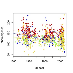
Last year I was working on a big dataset to assess how bee phenology has changed over time. Here it is the first cool figure I produced. I was quite excited so I didn’t even bother to make beautiful axes.

I am pretty sure the stats I finally used changed quite a lot, and I also added many more data points before publishing the results (it toke me a year to sort out all details), but the main result held. Bees are emerging earlier in recent time periods that they used to emerge. The final published figure looks like that:

While cleaning my computer today, I realised that my first plot looks way more colourful and exciting than the final figure I ended up publishing. Then, I remembered a text I wrote about analyzing data…

“I almost forgot the fun of first analysis when everything is new and exciting, when you want to know everything about “data” and you learn from “her” everyday… it’s a shame that after that it becomes repetitive and monotonous. You’ve lost the magic, but on the other hand, it’s also nice to really get to know each other, you gain compromise and confident results.”

So maybe my own plots can prove I was right, and Data analysis is like a love story. Are your first drafts also more pasional than the final version?


Long-term goals

I was skimming trough “How to Do Ecology” book from Karban and Huntzinger*, when I read that is important to have a long-term goal in your career. Something to use as a reference tool to see how your articles contribute to that goal and help you focus your career. I just panic for a second, not sure of having one. What if I am constructing my research program in an opportunistic way? Given I published on organisms as diverse as plants, birds or bees, or topics like biological invasions, pollination, or climate change, I was not sure that all this articles contribute to a long-term goal. The panic only lasted for a few minutes, as I realised that my main interest (and now my goal) is to understand human modified ecosystems. Indeed, I was quite happy to see that most of my research can help understand how this human dominated ecosystems work, or which species can survive in human modified ecosystems and which not, or how species adapt to live in human modified ecosystems. By that time I started thinking that Human Modified Ecology needs a good acronym, so I spent the next ten minutes trying to find a funny one… but that is less interesting (and I didn’t succeed). So the take home message is that I am glad to have verbalized my long-term goal, and be conscious of having one. I’ll take Karban’s advice and try to be more conscious of what I do and why I do it.

*I recommend that book to any grad student starting the PhD. Also good advice for everyone from Alon here and here.

Running motivation #An R amusement

Henry John-Alder told me once that in a marathon, twice as runners cross the line at 2h 59m than at 3h 00m. He pointed out that this anomaly in the distribution of finishers per minute (roughly normal shaped) is due to motivation. I believe that. I am not physically stronger than my friend Lluismo, in fact we are pretty even, but some times one of us beat the other just because he has the right motivation…

But where is the data? Can we test for that? Can we get a measure of how motivated are runners by looking at the race times distribution? The hypothesis is that runner groups that deviates from the expected finishing time distributions are more likely to contain motivated runners. It happens I did a race a couple of weeks ago, so I can fetch the results, create an expected distribution and compare that to the observed values.

I am interested in separating motivation from physical condition because is a real problem in behavioural ecology (See Sol et al. 2011). And because working with my race data is a lot of fun.

First we need to read the results from the webpage and extract a nice table:

# load url and packages
url <- "http://www2.idrottonline.se/UppsalaLK/KungBjorn-loppet/KungBjorn-loppet2012/Resultat2012/"

require(plyr)
require(XML)
require(RCurl)

# get & format the data
doc <- getURL(url)
doc2 <- htmlTreeParse(doc, asText = TRUE, useInternalNodes = TRUE)
tables <- getNodeSet(doc2, "//table")
t <- readHTMLTable(tables[[1]])
tt <- as.matrix(t)
tt <- as.data.frame(tt)
# Select only the 10K men class and make variable names
data <- tt[c(150:391), c(2, 3, 4, 6)]
colnames(data) <- c("place", "number", "name", "time")
head(data)

##     place number             name  time
## 150     1    624    Hedlöf Viktor 32:52
## 151     2    631      Vikner Joel 33:18
## 152     3    414   Sjögren Niclas 33:47
## 153     4    329    Swahn Fredrik 33:48
## 154     5    278    Sjöblom Albin 34:04
## 155     6    311 Lindgren Fredrik 35:31

Cool, we need to get the number of finishers per minute, now.

# create an 'empty' minute column
min <- c(1:length(data$time))
# if time has hour digits, transform to minutes
for (i in 1:length(data$time)) {
    if (nchar(as.character(data$time[i])) > 5) {
        min[i] <- as.numeric(substr(data$time[i], 3, 4)) + 60
    }
}
# select just the minute value for the rest of the data
min[1:237] <- as.numeric(substr(data$time[1:237], 1, 2))

And plot the number of finishers per minute

plot(table(min), xlab = "minute", ylab = "finishers per minute", xlim = c(30, 
    63))

That is approximately a normal distribution! (way better than my usual ecological data). In that case, let’s create an expected perfect normal distribution with mean and sd based on this race. I will use that as the expected times in the absence of motivation. If each runner performs accordingly only to its physical conditions; given enough runners they will fall in a perfect normal distribution (that is a model assumption).

# create the density function
x <- seq(32, 63, length = length(data$time))
hx <- dnorm(x, mean(min), sd(min))
# transform densities to actual number of expected finishers per minute:
# create an expected (e) 'empty' vector and for each minute calculate the closest x value and its correspondence density (hx) multiplied by the number of runners.
e <- c(32, 63)
for (i in 1:length(c(32:63))) {
    e[i] <- hx[which.min(abs(x - c(32:63)[i]))] * length(data$time)
}
# Check the total number of runners predicted is close to the real one (242)
sum(e)  #close enough

## [1] 239.1

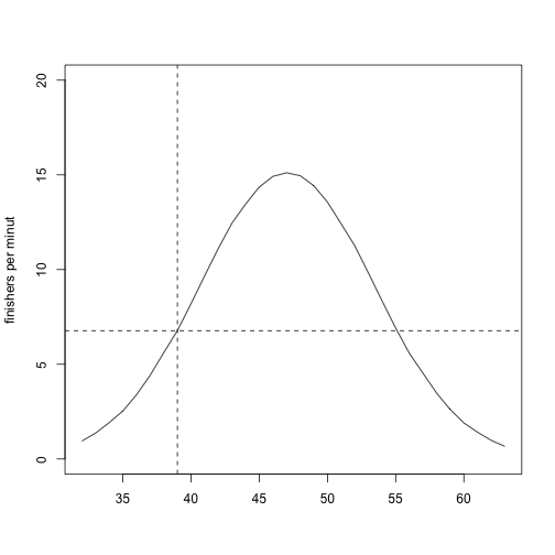
plot(c(32:63), e, ylim = c(0, 20), type = "l", ylab = "finishers per minute", xlab = "")
abline(v = 39, lty = 2)
abline(h = 6.77, lty = 2)

So, based on the plot, I predict 6.77 runners on 39 minutes (see dashed line), and 8.20 in 40. If being below 40 minutes is a goal, we expect motivation to show up there as a deviation from the expected values… Let’s plot both things together

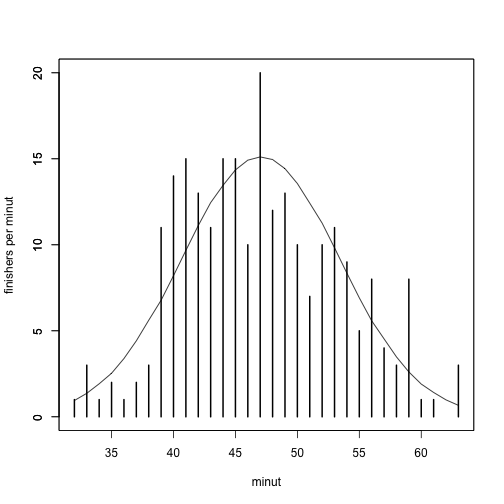
plot(c(32:63), e, ylim = c(0, 20), type = "l", ylab = "", xlab = "")
par(new = TRUE)
plot(table(min), xlab = "minut", ylab = "finishers per minut", ylim = c(0, 20), xaxt = "n")

Well, the observed value at 39 minutes is 11,  higher than the expected 6.77, but minute 40 and 41 are also higher than expected. Maybe being around 40 is the real motivation? We can visualize the observed minus expected values as follows:

o <- as.vector(table(min))
# add a 0 on minute 61, to make vectors of same length
o[31] <- 0
o[32] <- 3
# calculate difference
diff <- o - e
plot(c(32:63), diff, xlab = "minutes", ylab = "difference")
abline(h = 0, lty = 2)

Not a super clear pattern. But positive values for the first half of the finishers indicates motivation, however, take into account that positive values on the second part imply demotivation. Let’s do the sums:

sum(diff[1:16]) #1st half part

## [1] 10.75

sum(diff[17:32]) #second half

## [1] -7.892

The distribution is skewed to observe faster times than expected. I interpret this as an indication that most people was in fact motivated (half first part of the finishers deviations >> second half). We could have asked the people, but if you work with animals, they don’t communicate as clear (and humans can lie!). So, Is this approach useful? Maybe if instead of 242 runners and 10 k I use the NY marathon data, it will give us a clearer pattern? We will never know because is time to go back to work.

keep up with the literature…

sciseekclaimtoken-50660e34020be

I just find a 2009 paper I missed. How many of those will be out there? I did a commentary (Bartomeus & Winfree 2011) last year on how to track bee movements along different habitats. I did a quite intense literature research and I still missed this very relevant paper (Brosi et al 2009). Sorry, I have no excuses for not citing the paper on the commentary, and despite is true that I don’t usually read that Journal, I like a lot the first author work, so here my little amend:

I would like to have highlighted the paper in my commentary because despite the promising ideas it contains, no advance has been made in this direction in the subsequent years. Maybe other researchers missed that paper too? The paper propose using stable isotopes to track habitat use by pollinators. Despite the known correlation between habitat structure and pollinator diversity and abundance, little is known on which habitats use different pollinator species and specially in which proportions. This knowledge is important to understand the effect of land use change on pollinator persistence, but can be used for answering multiple questions ranging from ecosystem services to pollinator population dynamics. The main limitation faced by researchers so far is the inherent difficulty to track individual specimens movements.

The goal of the paper is to utilize the naturally occurring differences in isotopic composition among habitats to characterize habitat-based bee foraging changes within a landscape context. In this case they characterize the use of agricultural or forested areas. The researchers found a significant relationships between the carbon and nitrogen isotope signals on bees depending on the season, the landscape context and the local biotic context. Though they could not estimate proportions of different habitat uses due to high variances in the stable isotopes signal, they claim that this important step can be achieved in other systems. If so, the ability to calculate isotope mixing models (which estimate the proportion of different habitats use) would be useful for most investigations of pollinator foraging in the context of ecosystem services.

References:

Bartomeus I., Winfree, R. (2011) The Circe Principle: Are Pollinators Waylaid by Attractive Habitats? Current Biology 21(17): 653-655

Brosi, B.J., Daily, G.C., Chamberlain, C.P. & Mills, M. (2009). Detecting changes in habitat-scale bee foraging in a tropical fragmented landscape using stable isotopes, Forest Ecology and Management, 258 (9) 1855. DOI: 10.1016/j.foreco.2009.02.027

Why Postdocs are the teenagers of academia.

I’m starting my third postdoc. After two postdocs, I thought it would be nice to have my own lab, but given the situation in my home country, doing another postdoc is more appealing, specially in a good lab and with a flexible project. Then, I realised I should stop thinking about the future and enjoy up to the last second of my postdoctoral stage. What’s the hurry? We, Postdocs are the teenagers of Academia. We are not leaving with our parents anymore, but we still don’t have family responsibilities. And just to be clear, by parents I mean PhD advisors, and by family your own grad students. All teenagers want to grow fast, but hey, once you’ve grown you miss your teenage instability, experimenting with new things, the lack of long term responsibilities, the hormonal up-and-downs with high days just after submitting a ms to Science and the down days where you get rejected and nothing makes sense. I don’t want to be a teenager forever, but while I am here, I will use my time to hangout with other teenagers, keep trying new risky things and enjoy this period I know someday i will miss.